If you prefer to access this information in American Sign Language (ASL), please contact the office at info@deafinitelyhousing.org or video call 720-372-1040 to schedule a time to connect with a Deafinitely Housing volunteer. Thank you!

More Than a Logo: The Story and Meaning Behind Deafinitely Housing
October 1, 2026
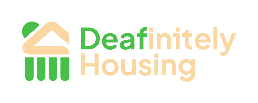
The Deafinitely Housing Board approved the logo shown above at its first-ever Board retreat at the inspiring Nyland Cohousing in Lafayette on June 7, 2026, following months of drafting, discussion, and deliberation.
In fact, the logo was first roughly drafted even before Deafinitely Housing was officially recognized by the IRS as a 501(c)(3) nonprofit organization on August 12, 2025. In many ways, that early sketch marked the beginning of the organization’s visioning process.
After many attempts to determine the most meaningful design – including its colors, shapes, size, and intended purpose – the Board agreed to work with a professional Deaf digital designer, Caleb Pendley, owner of Fat Toad Studio. Caleb had been a student at Rocky Mountain Deaf School (RMDS) when the school was designing its new building in the summer of 2013. He represented RMDS as a student summer intern at Anderson Mason Dale Architects, working alongside Robert Sirvage, a Deaf Space consultant from Gallaudet University.
Caleb and Deafinitely Housing initiator Cliff Moers, who also led the founding team for RMDS, along with the Deafinitely Housing Board, connected and worked together to refine the design and arrive at the final logo. Their collaboration is itself a representation of how deeply intertwined the DDBDDHH communities are.
That early connection between Deaf community vision, architecture, and design would later become part of the story behind Deafinitely Housing’s own visual identity.
A Logo with Purpose
The logo is more than a visual identity. Its elements are intentionally rooted in the organization’s history, mission, and connection to the DDBDDHH communities.
The colors of the Deafinitely Housing logo are inspired by the Earth and the natural world, reflecting our connection to the land we call home. Inspired by earth, mountains, trees, and sunlight, they represent grounding, belonging, and our connection to the places where we live.
The green evokes trees, growth, and interconnectedness, while the warm golden tone reflects earth, sunlight, warmth, and belonging. Together, these colors represent our relationship with the natural world and the communities we call home.
The interconnectedness of the DDBDDHH communities is reflected in the roots, or foundation, beneath the house and mountain silhouette. These roots symbolize the way an aspen grove grows as a connected organism, with new trees emerging from the root systems of others. The imagery reflects the strength, interconnectedness, and continuity of our communities.
The roof of the house in the logo mirrors the shape and silhouette of the mountain. Together, the house and mountain symbolize Deafinitely Housing’s mission and the place from which the organization originated.
The half-dome sun rising above the roof and mountain silhouette represents hope for the DDBDDHH communities and their community stakeholders. The warmth of the sun also evokes the beauty and welcoming spirit that we hope Deafinitely Housing will bring to the communities it serves.
In this way, every element of the logo carries meaning. It is more than a logo – it is a visual expression of our history, our connections, our purpose, and our hope for the future.